
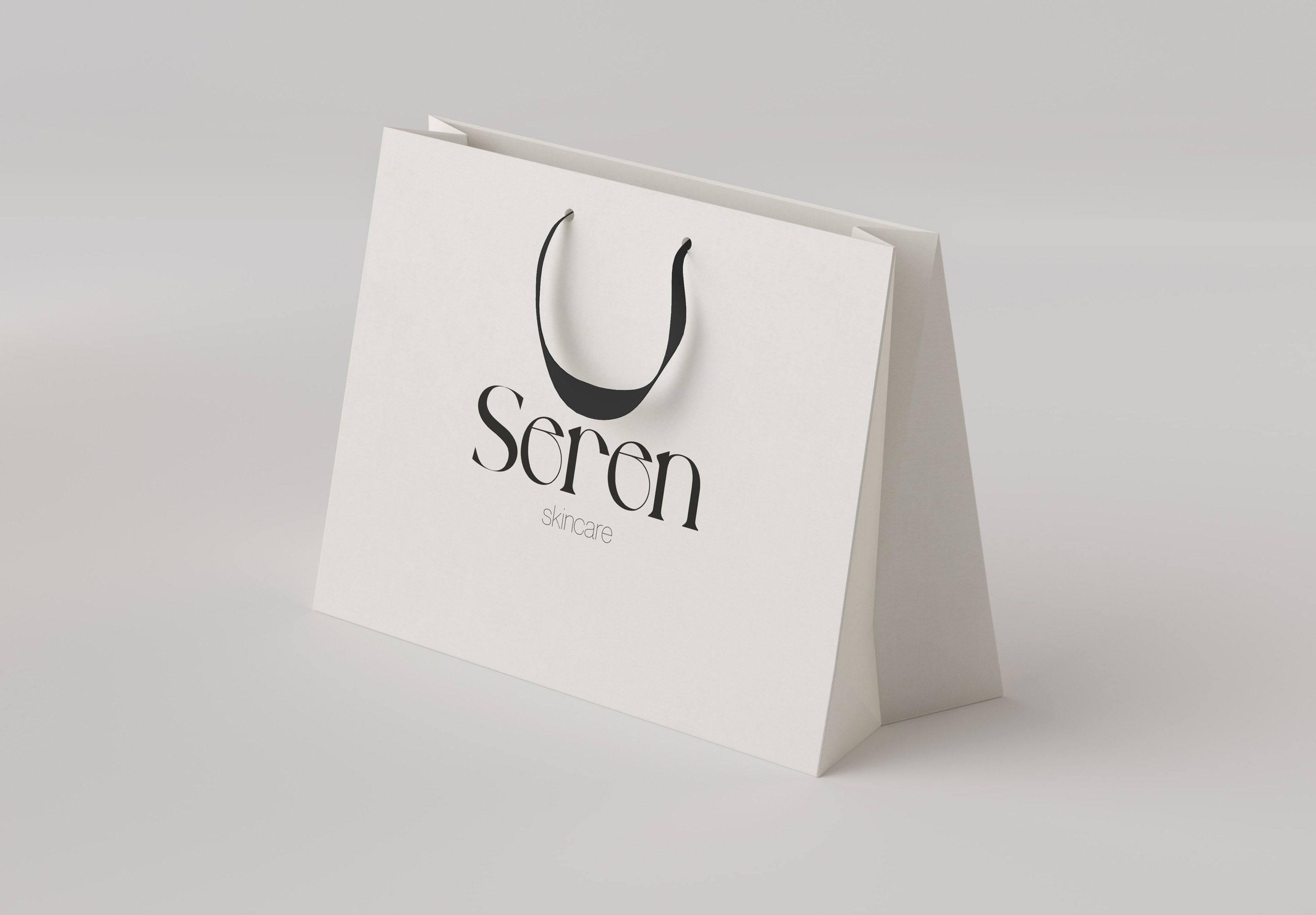
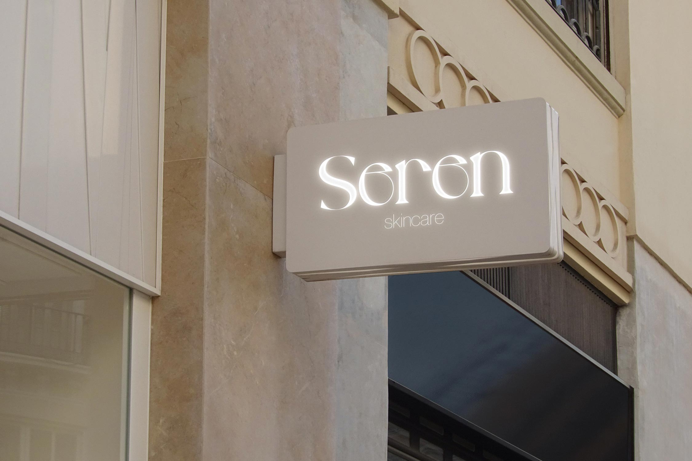
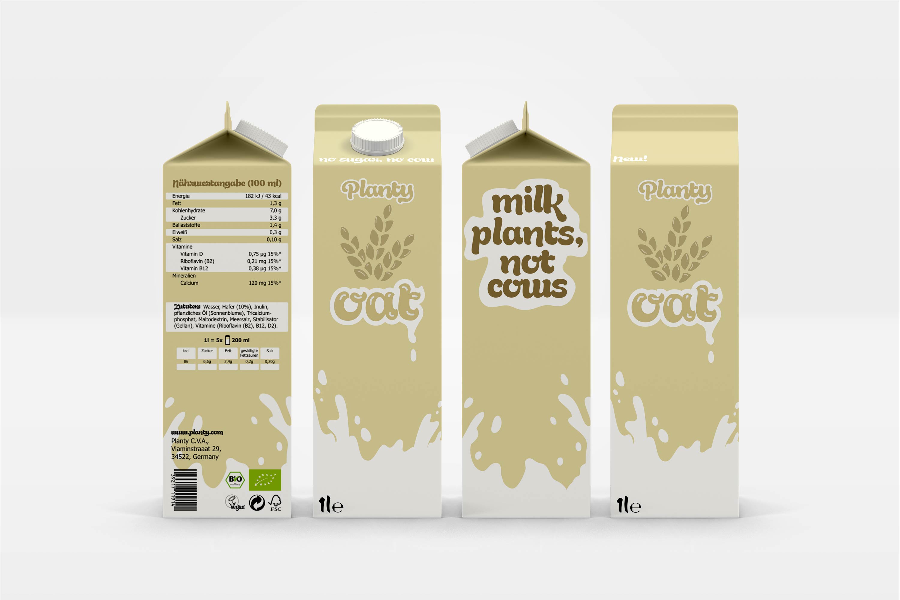
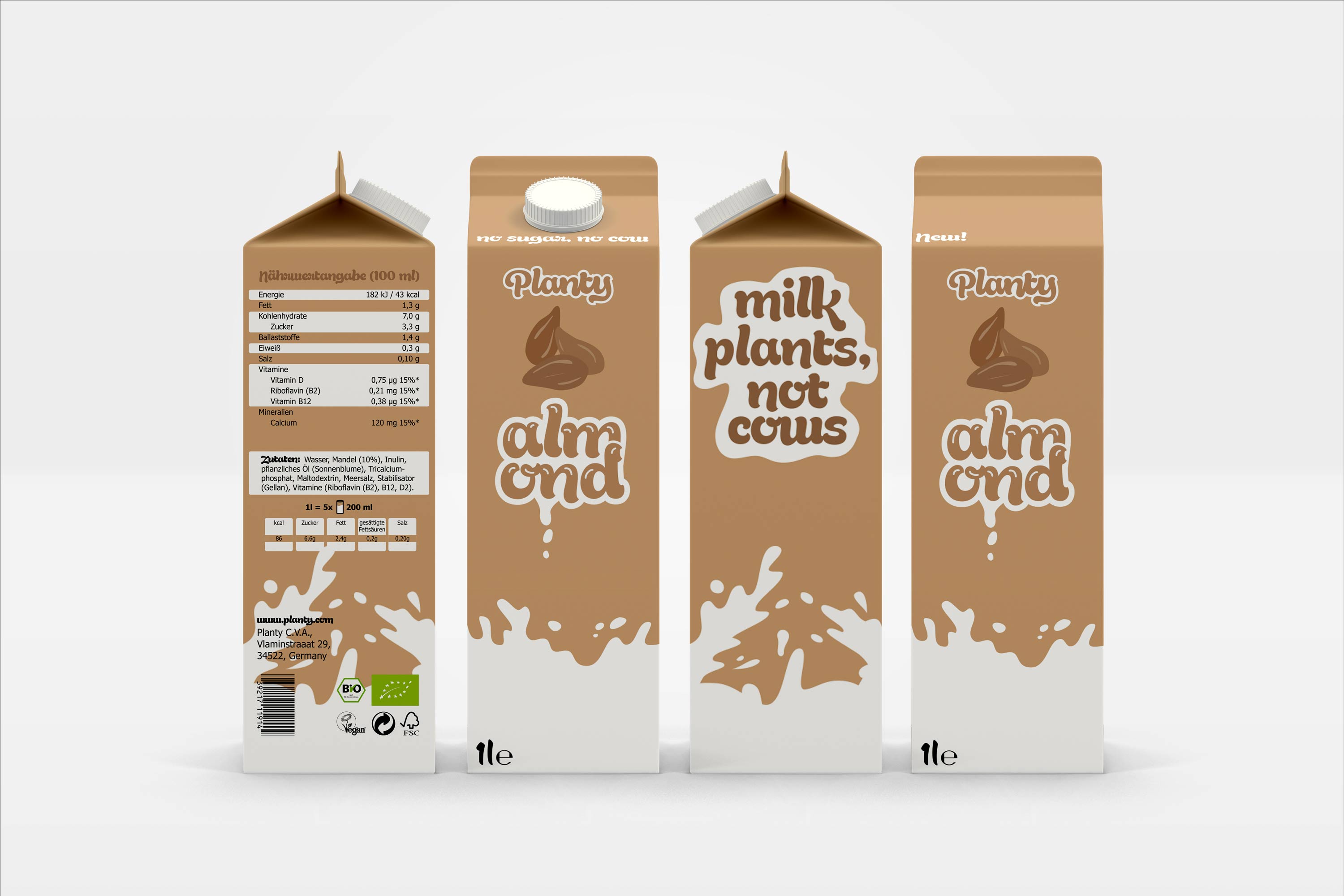
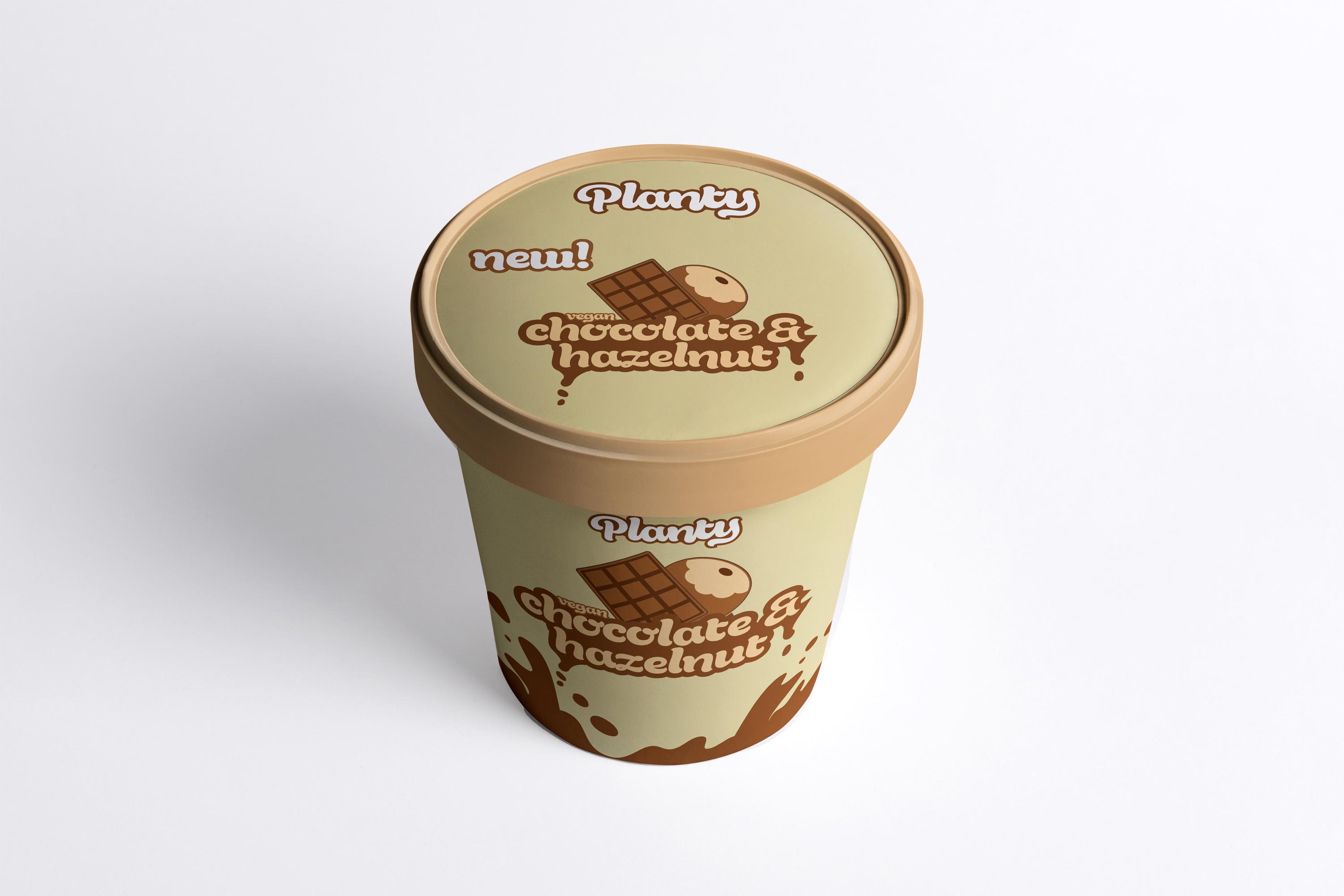
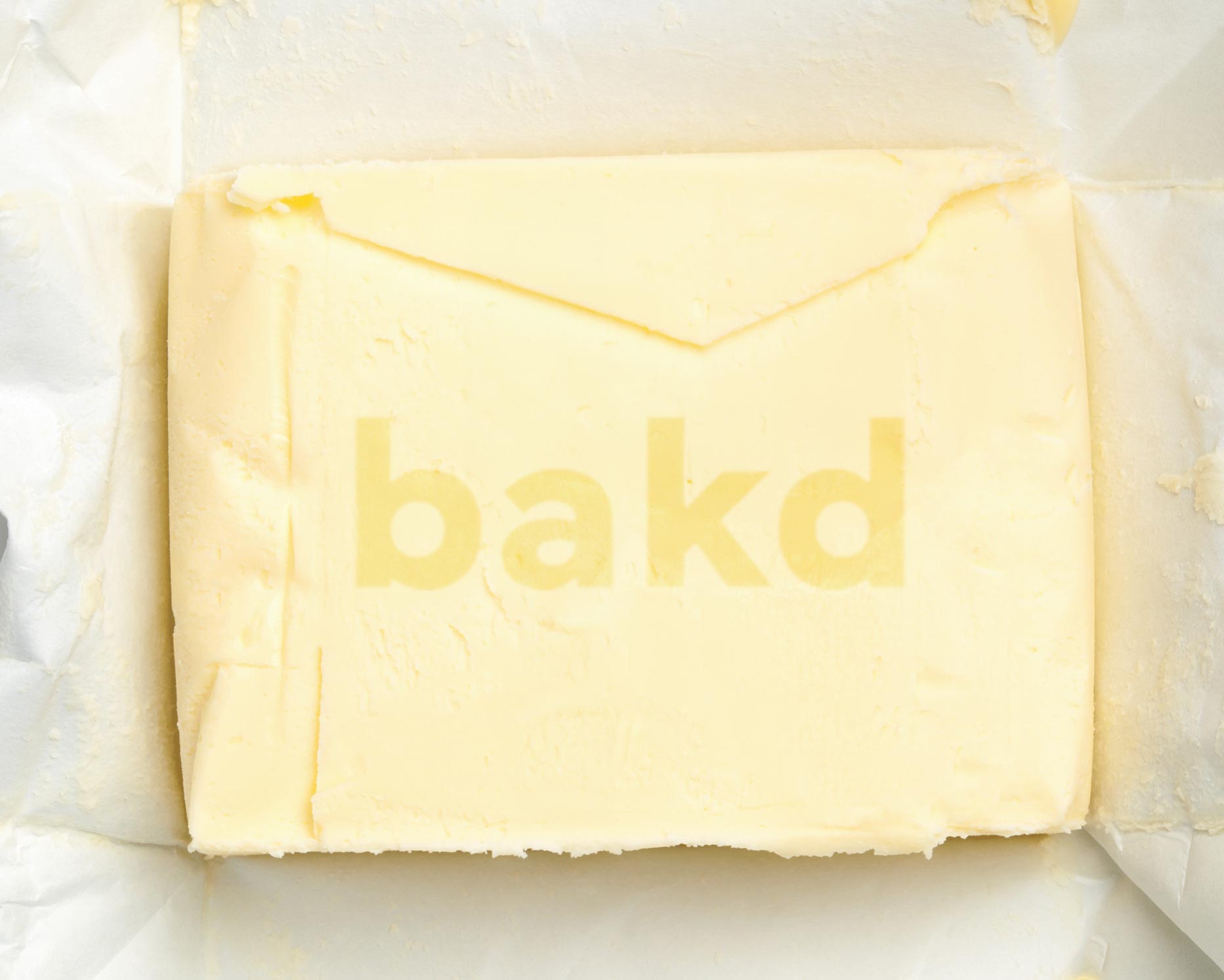
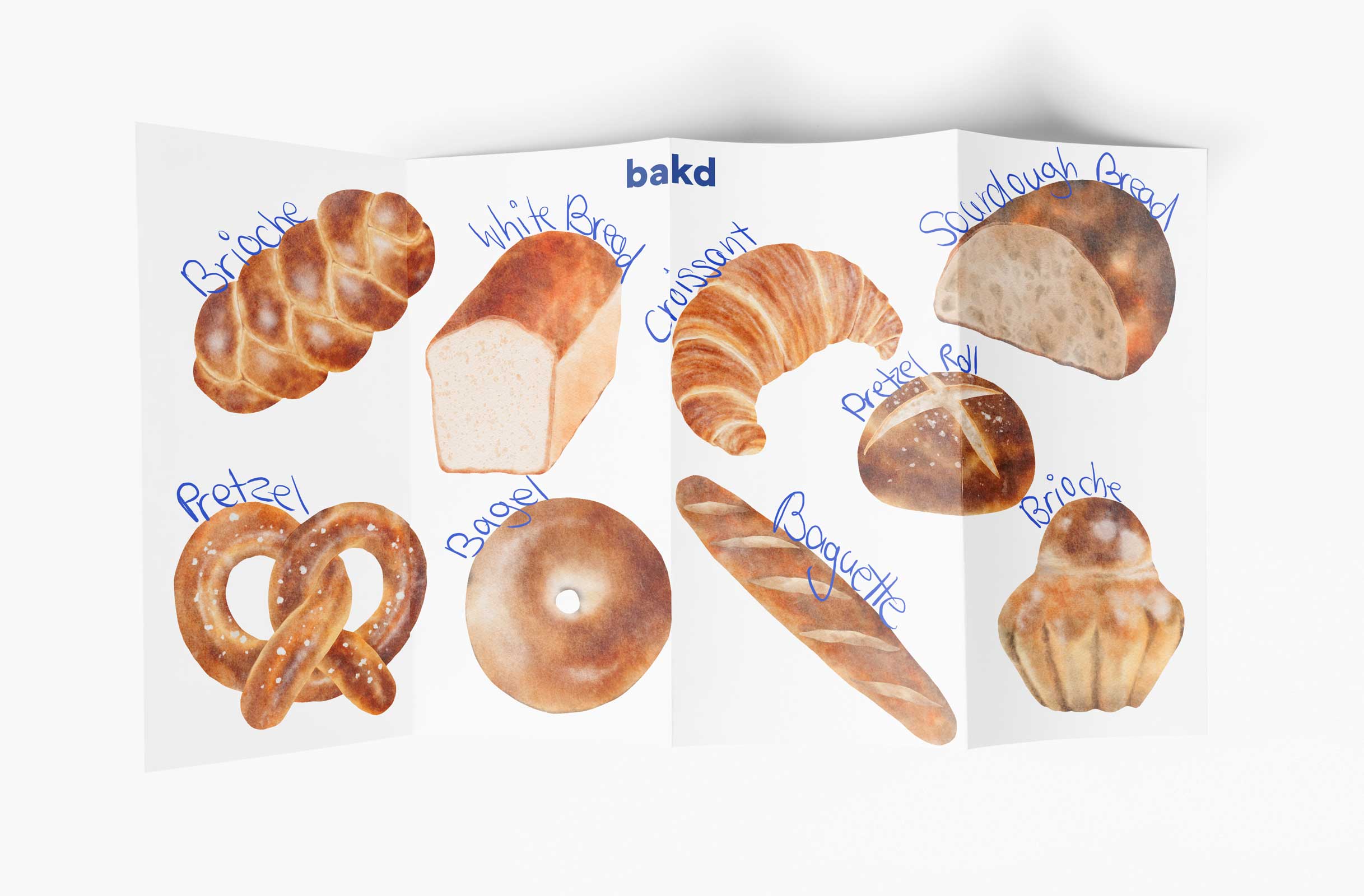
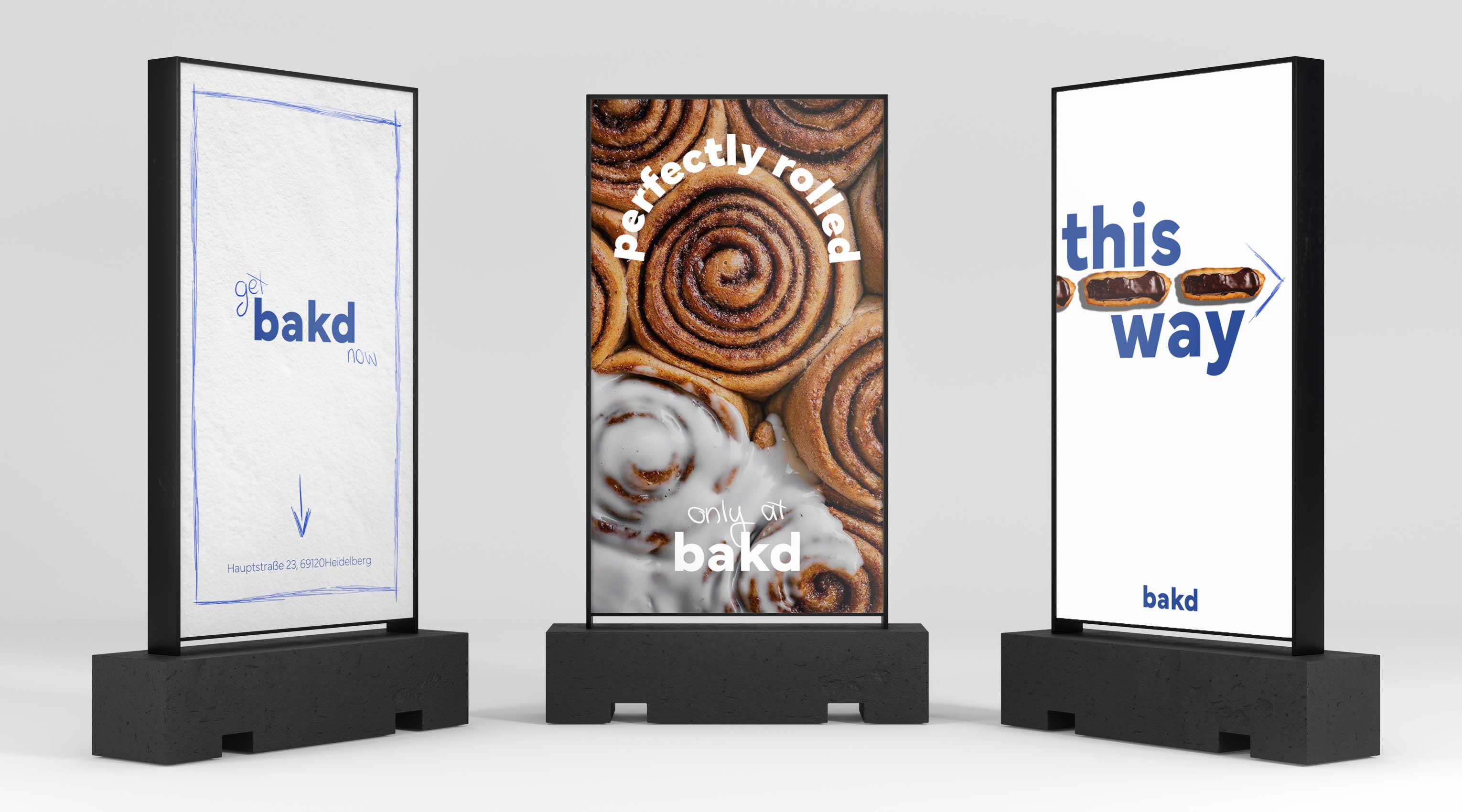
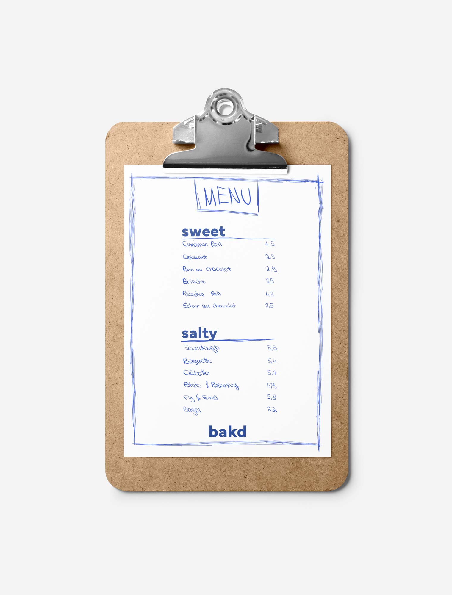
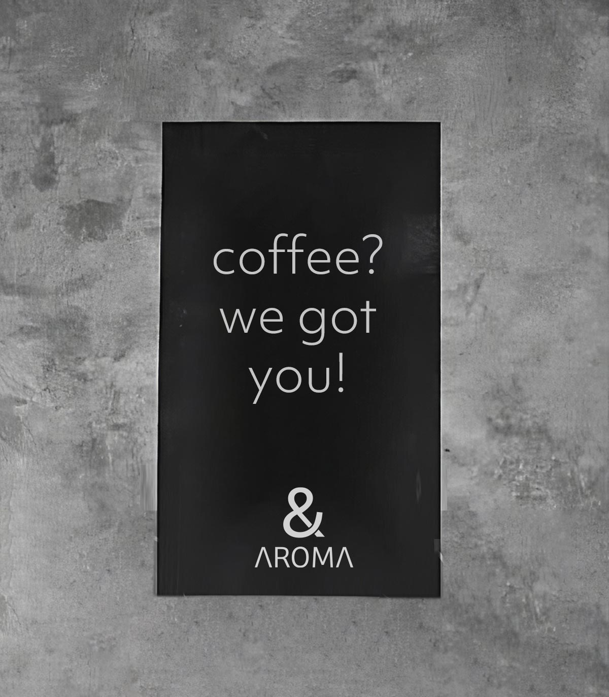
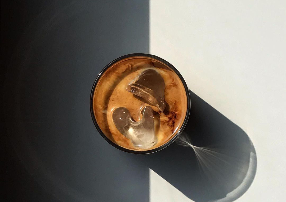
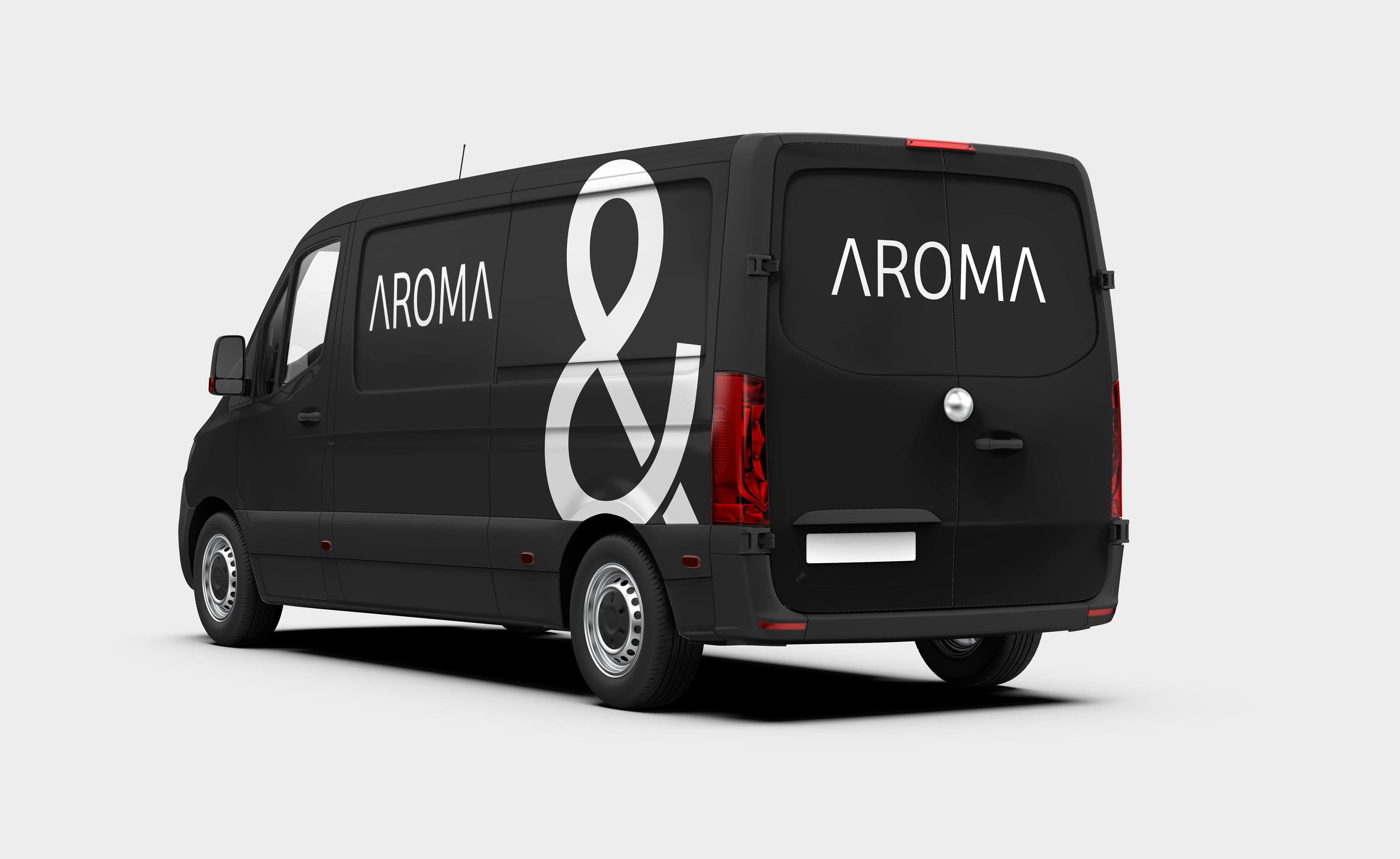
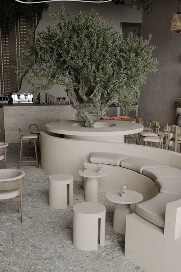
The branding for Seren Skincare reflects luxurious simplicity. The use of sleek, sophisticated fonts paired with a monochromatic color scheme creates a refined and high-end feel. This pure and elegant aesthetic appeals to consumers looking for high-quality skincare products that align with their values of simplicity and natural beauty.
Branding
seren
2023
Seren, the embodiment of modern skincare luxury, is an oasis of tranquility in the world of beauty. At Seren, the journey to radiant and youthful skin begins with a philosophy deeply rooted in the pursuit of inner peace and outer beauty.
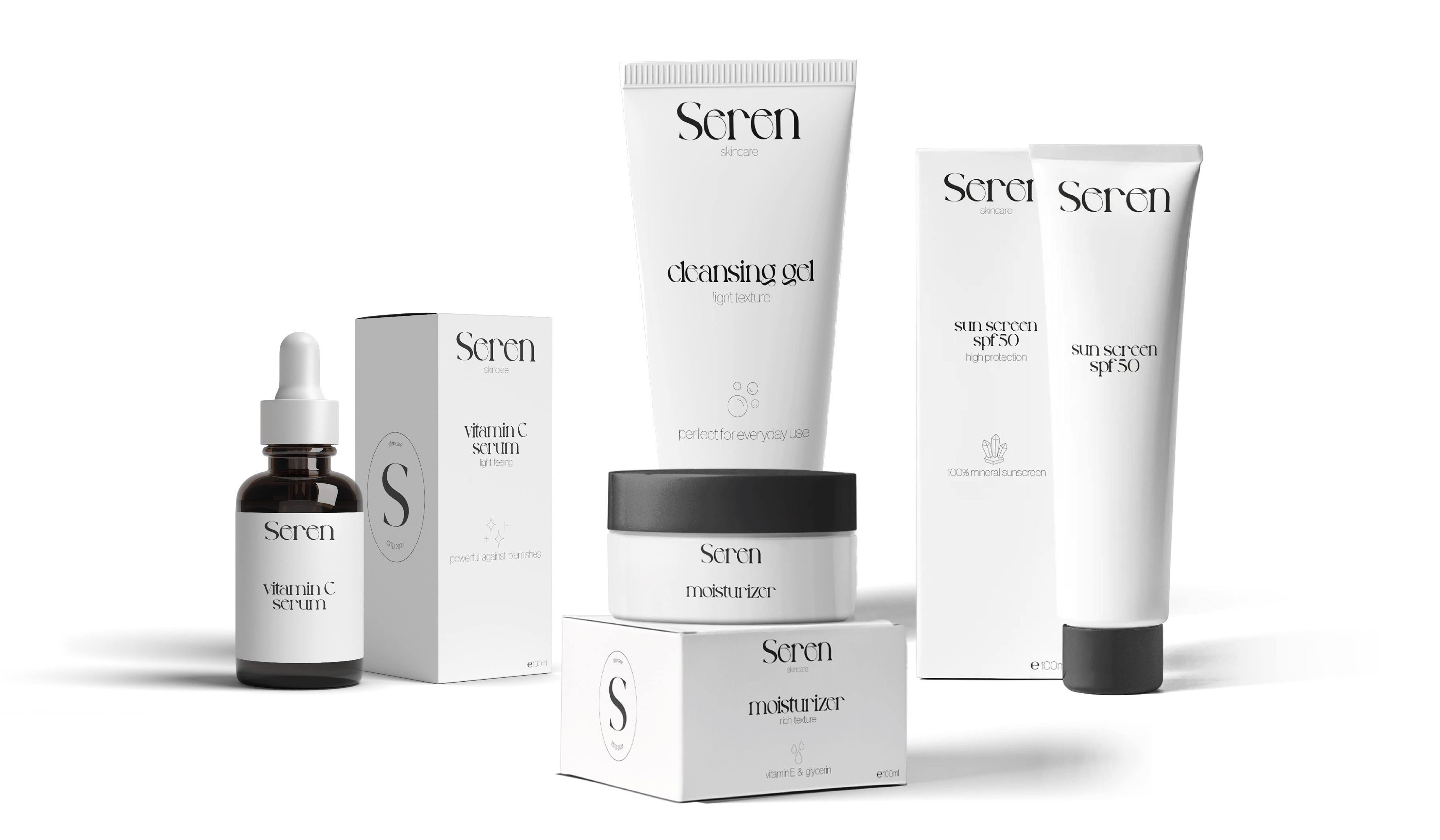
The creation of Seren was a meticulous and thoughtful journey. I embarked on a quest to capture the essence of serenity and sophistication in every aspect of the brand. The result is a packaging design that reflects the very core of Seren's identity – modernity, minimalism, and clarity.
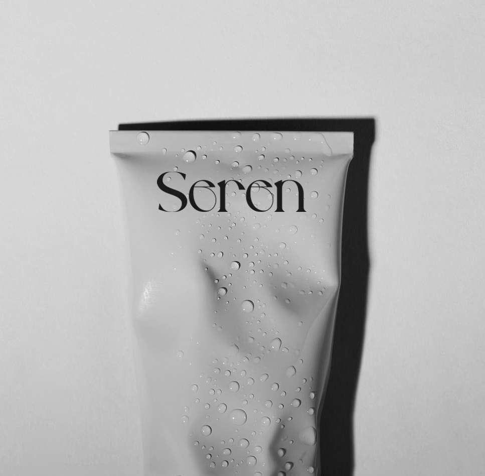
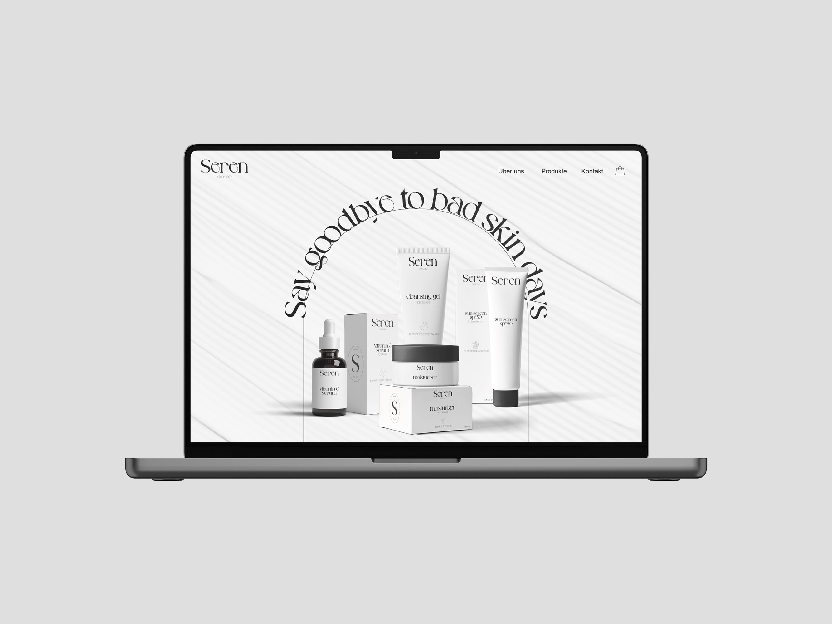
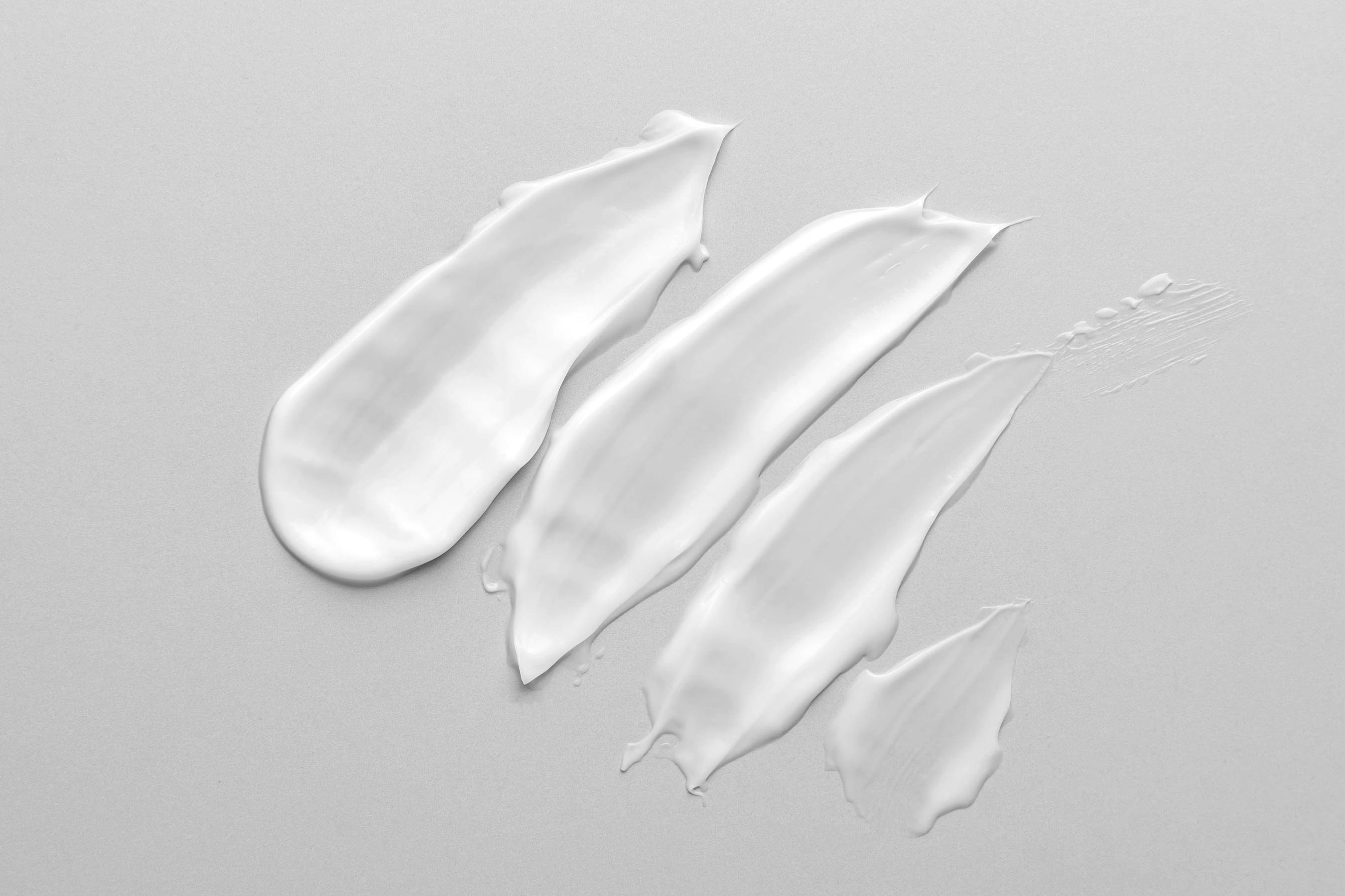
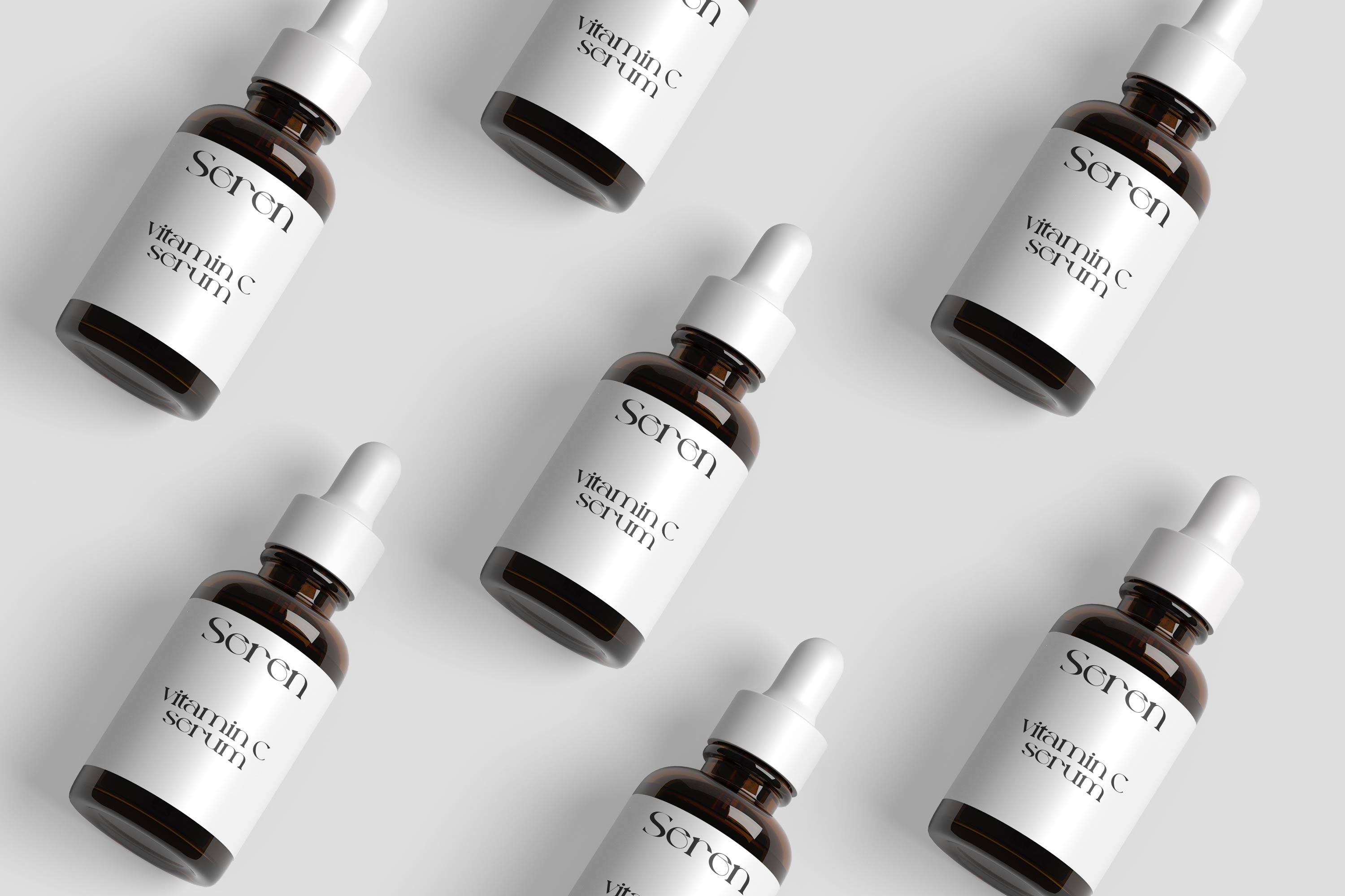
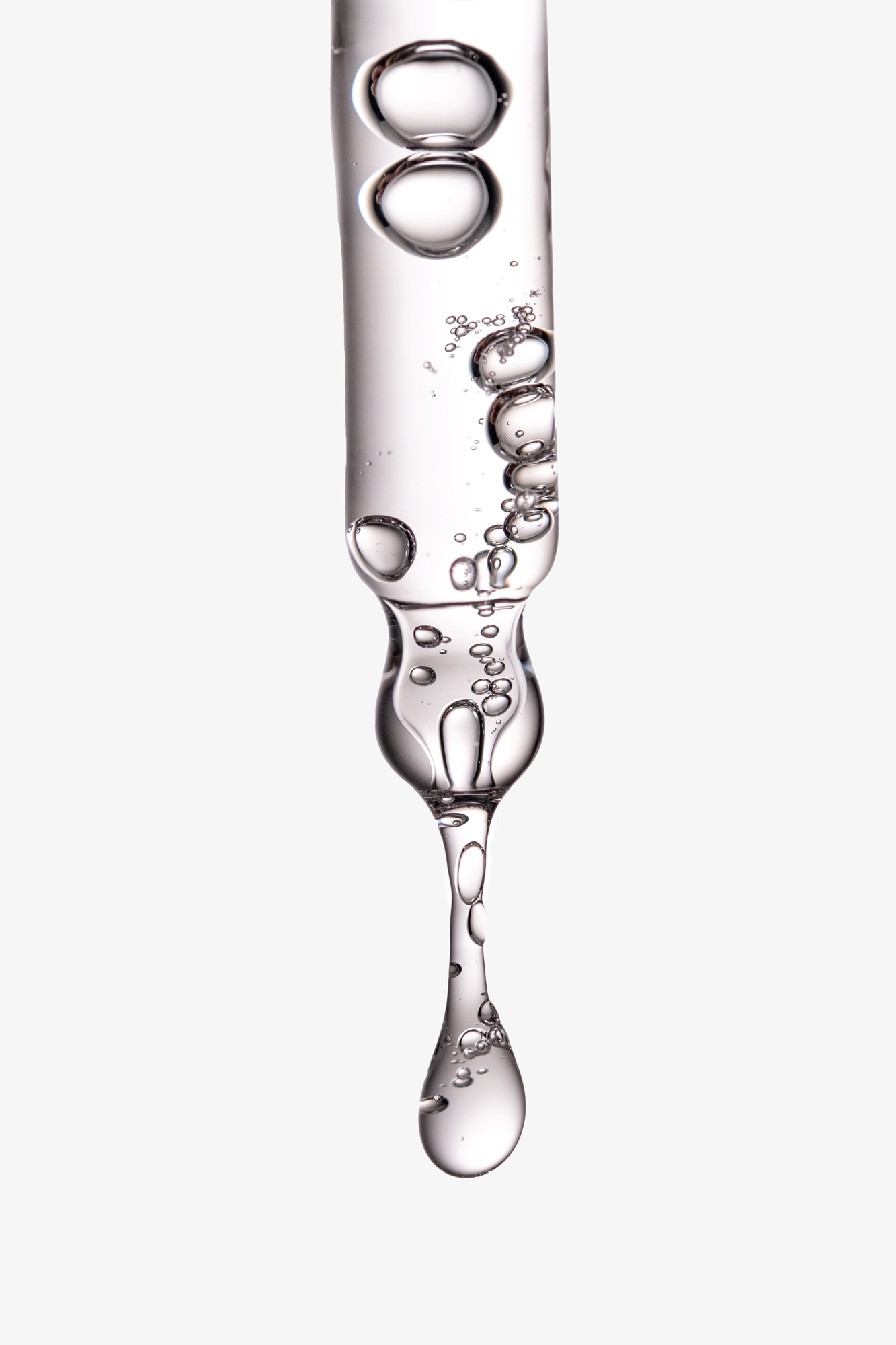
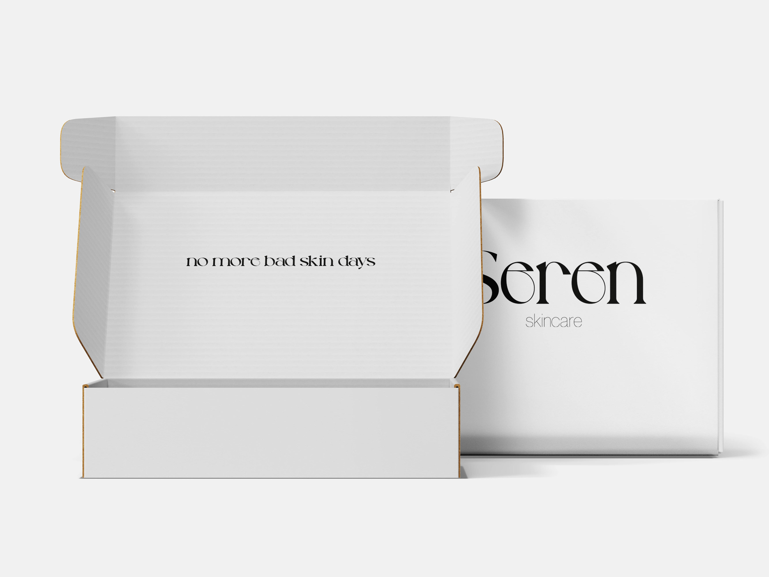
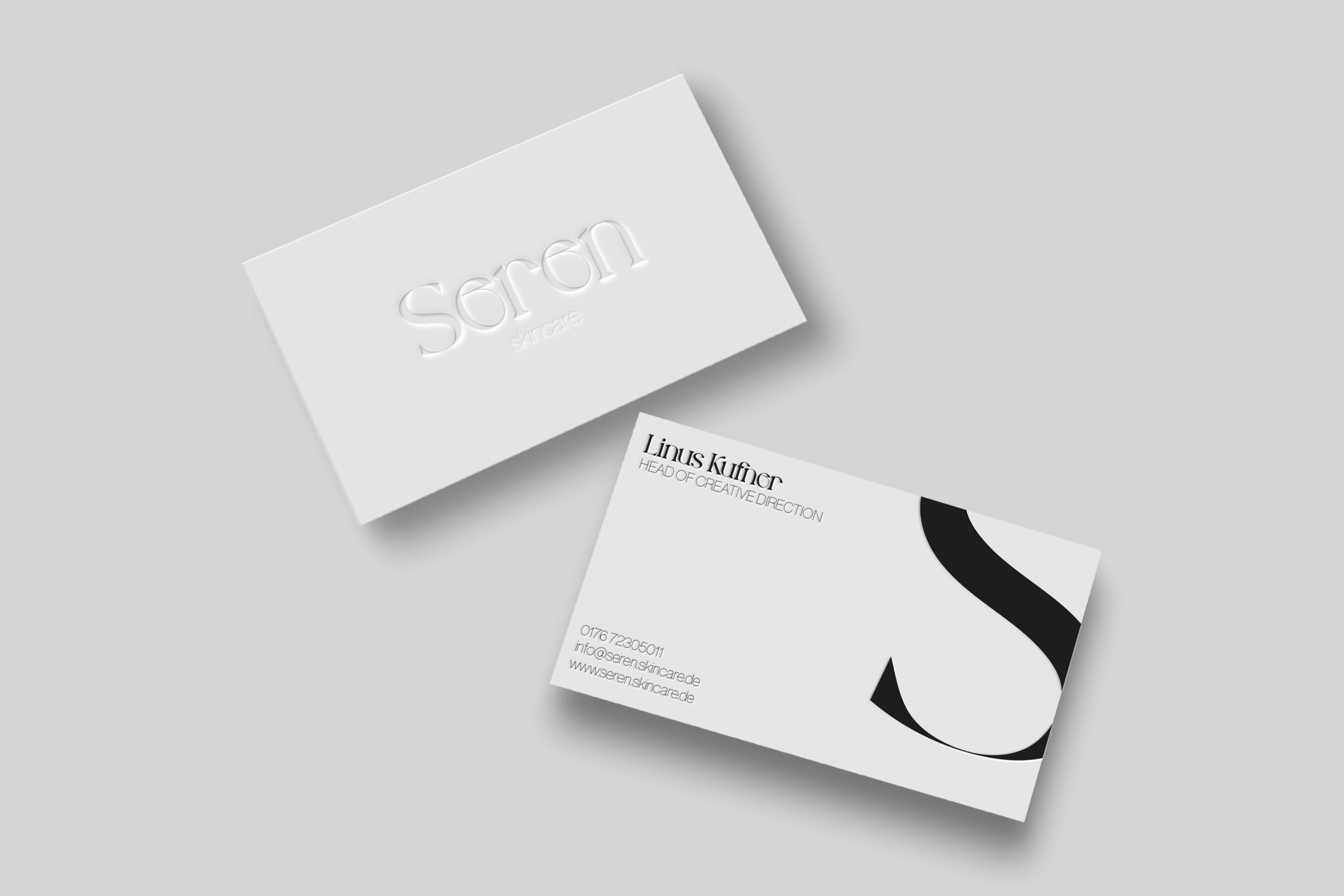
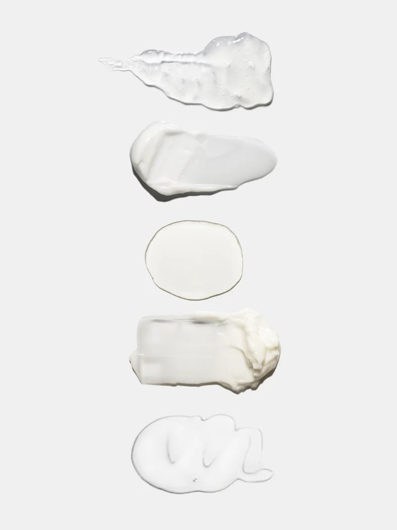
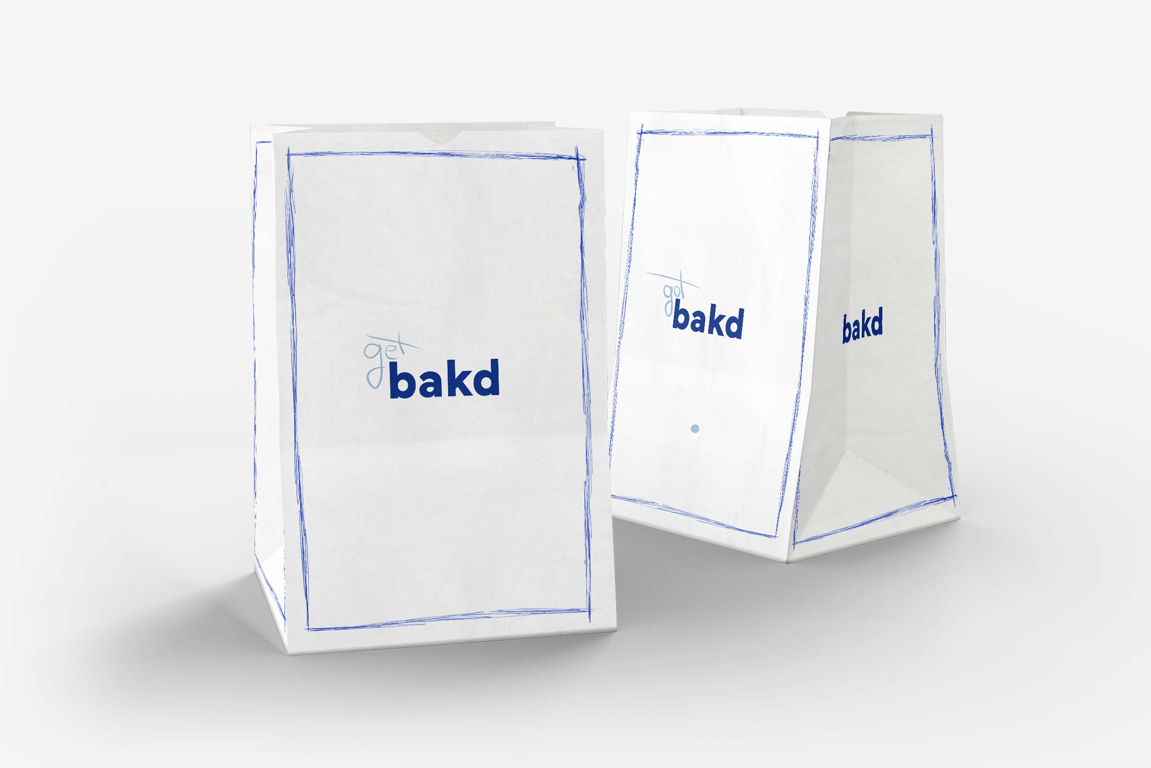
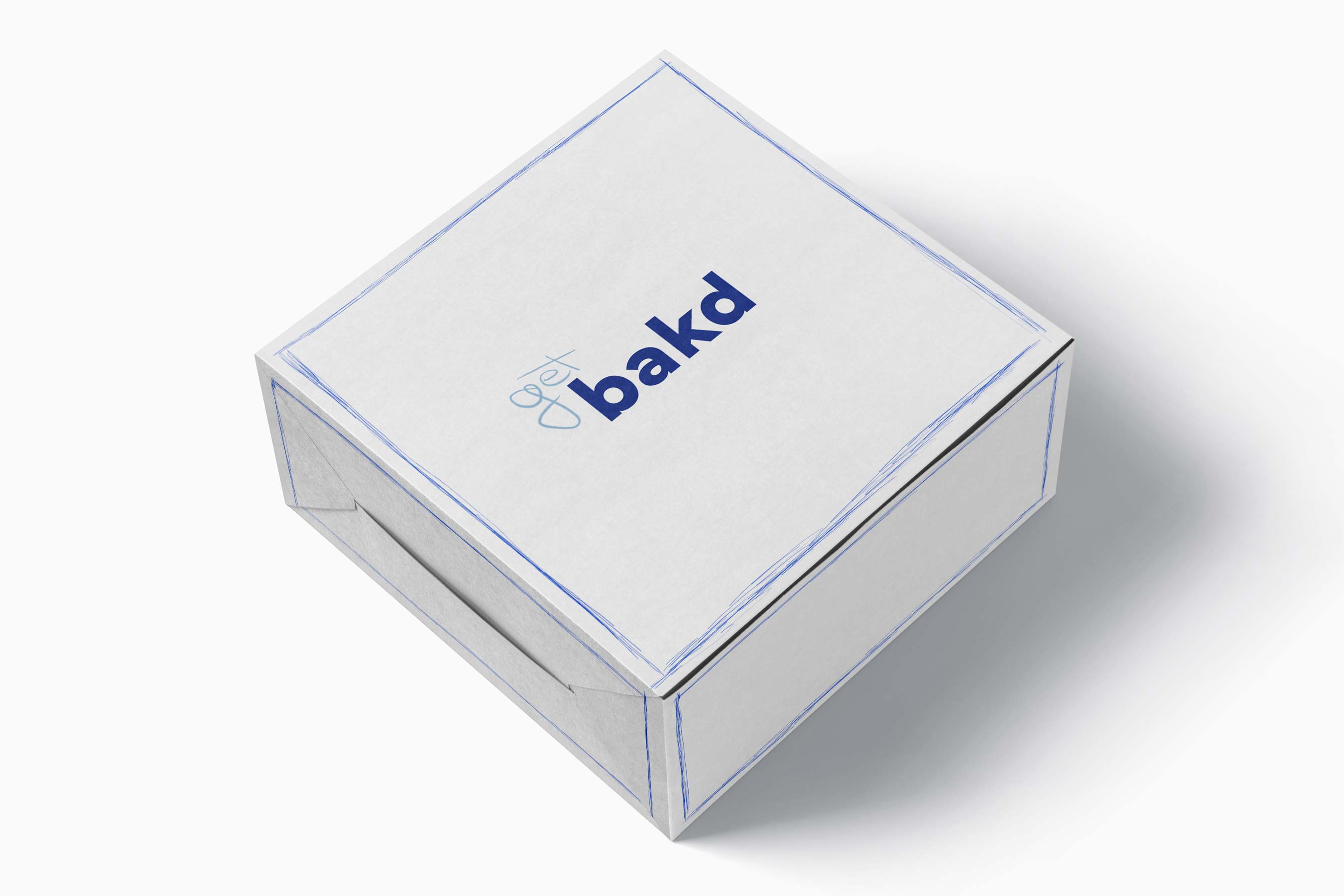
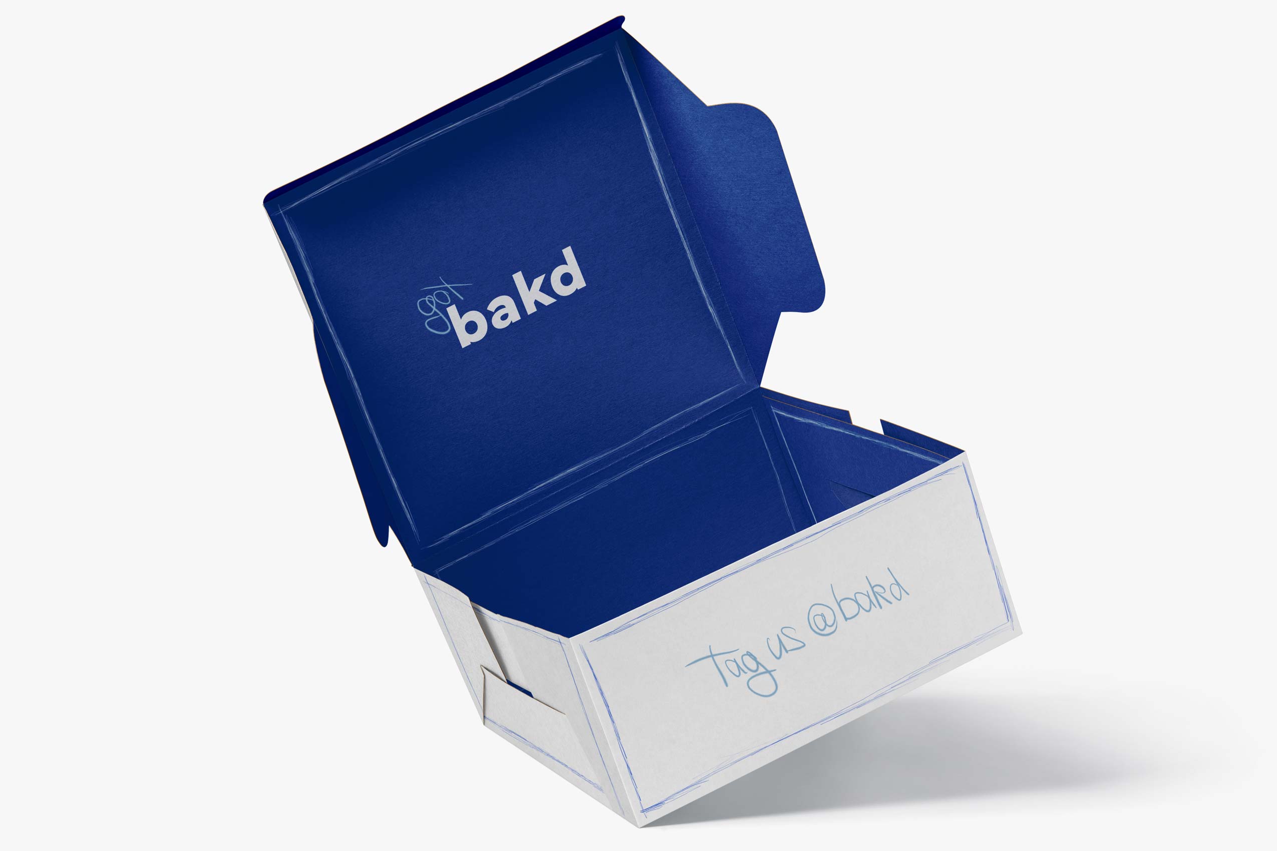
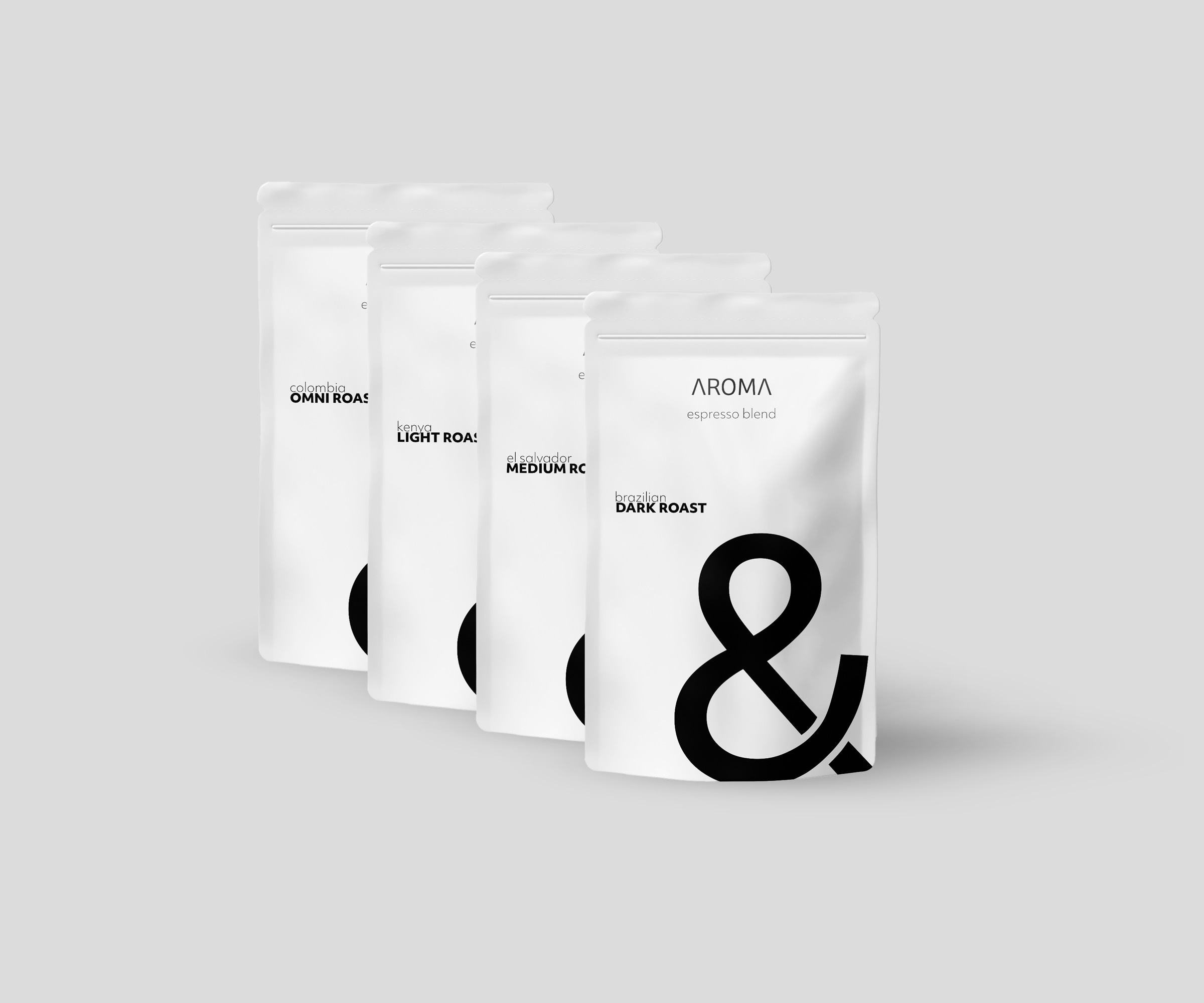
Seren's packaging design is a testament to the brand's commitment to simplicity. Clean lines, uncluttered spaces come together to create a visual harmony that mirrors the calming effects of our skincare products. The minimalist approach is deliberate, allowing the focus to remain squarely on the rejuvenating power of our formulations.
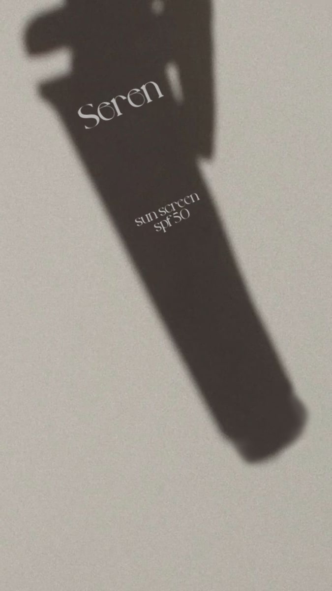
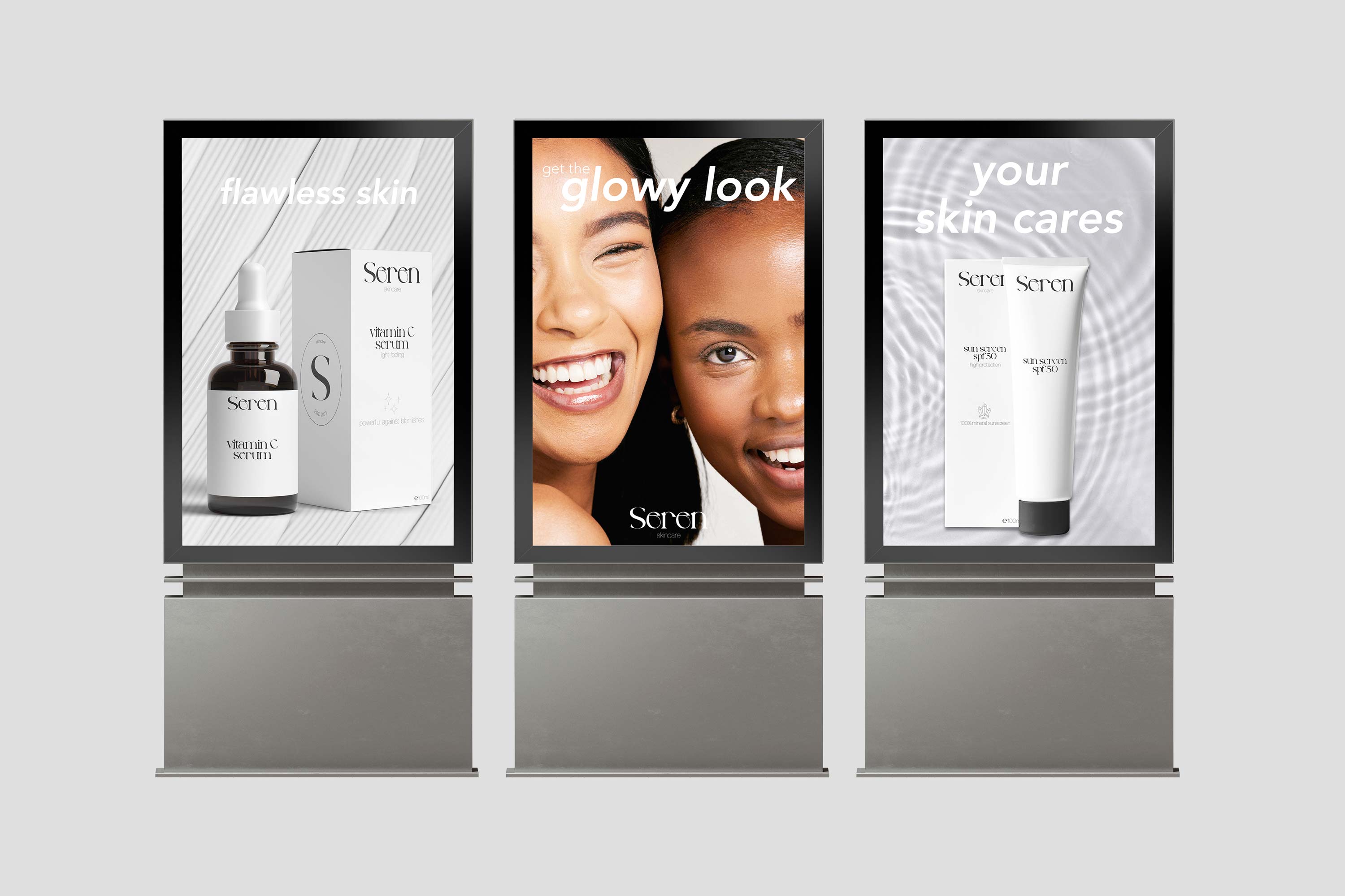
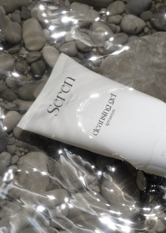
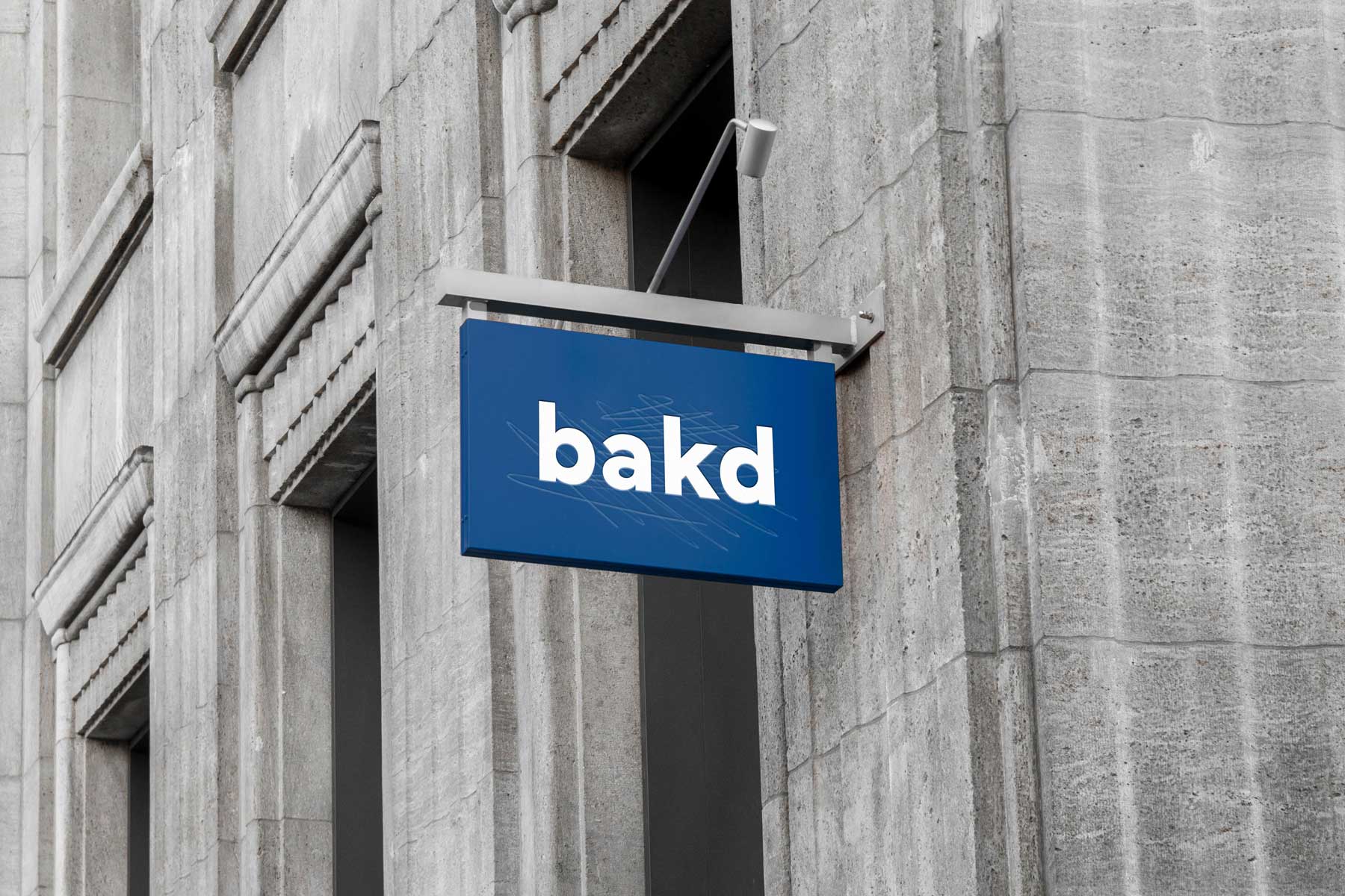
The design process for Seren was driven by a desire to resonate with the contemporary consumer, who values both aesthetics and high quality. The sleek, matte packaging with the seren logo is not just visually striking, but also a pleasure to hold. It's an embodiment of the brand's promise – to elevate your skincare routine to an experience of serenity.
Throughout the design journey, I contemplated the brand's message: that true beauty arises from the synergy between inner tranquility and effective skincare. Seren's packaging is a mirror that reflects the profound connection between simplicity and sophistication, calmness and confidence.
In a world of excess and noise, Seren stands as a testament to the power of less-is-more. The minimalist design isn't just an aesthetic choice; it's an invitation to a lifestyle where skincare is a ritual, an art form, and a moment of personal serenity.
Seren is more than just skincare; it's a reminder that beauty is a reflection of inner peace. Experience the magic of modern minimalism with Seren – where beauty meets serenity.
Seren, the embodiment of modern skincare luxury, is an oasis of tranquility in the world of beauty. At Seren, the journey to radiant and youthful skin begins with a philosophy deeply rooted in the pursuit of inner peace and outer beauty.
The creation of Seren was a meticulous and thoughtful journey. I embarked on a quest to capture the essence of serenity and sophistication in every aspect of the brand. The result is a packaging design that reflects the very core of Seren's identity – modernity, minimalism, and clarity.
Seren's packaging design is a testament to the brand's commitment to simplicity. Clean lines, uncluttered spaces come together to create a visual harmony that mirrors the calming effects of our skincare products. The minimalist approach is deliberate, allowing the focus to remain squarely on the rejuvenating power of our formulations.
The design process for Seren was driven by a desire to resonate with the contemporary consumer, who values both aesthetics and high quality. The sleek, matte packaging with the seren logo is not just visually striking, but also a pleasure to hold. It's an embodiment of the brand's promise – to elevate your skincare routine to an experience of serenity.
Throughout the design journey, I contemplated the brand's message: that true beauty arises from the synergy between inner tranquility and effective skincare. Seren's packaging is a mirror that reflects the profound connection between simplicity and sophistication, calmness and confidence.
In a world of excess and noise, Seren stands as a testament to the power of less-is-more. The minimalist design isn't just an aesthetic choice; it's an invitation to a lifestyle where skincare is a ritual, an art form, and a moment of personal serenity.
Seren is more than just skincare; it's a reminder that beauty is a reflection of inner peace. Experience the magic of modern minimalism with Seren – where beauty meets serenity.
previous
next


.svg)